PlanB, an anonymous analyst famous for his S2F (Stock-to-Flow, Stock-to-Flow) model, has successfully predicted the BTC price many times during the bull market. He updated the S2F model data in mid-July and boldly predicted that in this cycle ( 2020~2024) The price of Bitcoin can reach $500,000.
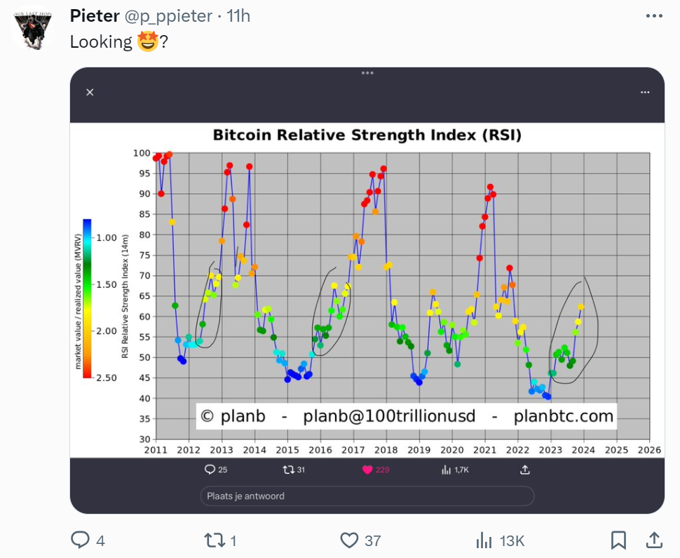
Today, PlanB once again released a new Bitcoin analysis chart on X, and said in surprise, "Oh my God!" Although no detailed explanation was given, the shared RSI line chart, MVRV ratio represented by different colors, and the tag "#AsymmetricBets" all provide intriguing and worth interpreting information, revealing his bullish stance on Bitcoin.
RSI between 60 and 65: Extreme overbought conditions have not been reached yet
First of all, RSI (Relative Strength Index, Relative Strength Index) is an indicator that measures the momentum of price changes and is used to determine the overbought or oversold status of an asset.
In the stock market, an RSI above 70 usually means overbought, while an RSI below 30 may indicate oversold. While the absolute numbers of overbought or oversold may vary in the Bitcoin market, the focus is on comparing relative levels.
As can be seen from PlanB's chart, Bitcoin's RSI is currently in the range of 60 to 65. Compared with the high of 90 during the past bull market, it shows that the current momentum has not yet reached an extreme overbought state.
MVRV falls below 2: the current market price is twice the average purchase price
Additionally, changes in dot color in the chart represent changes in market cap to realized market cap ratio (MVRV). MVRV is the ratio of outstanding market capitalization to realized market capitalization, where:
- The circulating market capitalization refers to the product of the "current price" and the total circulating amount.
- The realized market capitalization is calculated by multiplying the "average price of each Bitcoin at the time of its last transaction" by the total circulating supply.
The realized market capitalization is equivalent to the average purchase cost of holders, so the MVRV ratio can be regarded as an indicator of Bitcoin's current market price relative to the holder's cost.
PlanB's chart shows that the MVRV is now around 2, meaning the current market price is roughly double the average buying price.
AsymmetricBets Tag Meaning: The Holy Grail of Investing
The term " AsymmetricBets " is composed of "Asymmetric" (asymmetry) and "Bets" (bets), and is used to describe investments where the potential returns are far greater than the possible losses.
In other words, risk a small loss to potentially make a large profit. Finding asymmetric risk and reward opportunities in capital markets is considered the Holy Grail, but it is not easy, requires risk management measures, counterintuitive thinking, and is not suitable for emotionally unstable investors.
Summary: PlanB is bullish on Bitcoin
PlanB combines the MVRV ratio and the RSI indicator in this chart to provide investors with a perspective to judge the timing of buying and selling Bitcoin. For example, a high RSI and high MVRV may indicate that the market is overheated, while a low RSI and low MVRV may be a buy signal.
In this regard, netizen Pieter compared the past trend chart of the chart and speculated that PlanB is suggesting that RSI and MVRV may rise further in the future, indicating that he is optimistic that Bitcoin will have further room to rise in the future.
Coupled with the "#AsymmetricBets" tag, it means that PlanB believes that the current upside potential of investing in Bitcoin may be far greater than the downside risk.
However, it is worth noting that these indicators are not completely in sync with Bitcoin price movements. For example, when Bitcoin reached its all-time high price in late 2021, these indicators did not reach new highs. Therefore, investment analysis should comprehensively use a variety of tools and knowledge. No single chart can comprehensively explain the basis for all investment decisions.


