The only one who can buy is the apprentice, the one who can sell is the master. He can explain all the mysteries of the market in one sentence. Imagine that when you buy a position, it brings profits at the beginning, and then keeps soaring, with huge floating profits. You think it will reach your psychological price, and you imagine that the next craziness is about to come.
As a result, the market came to an abrupt halt.
At this time, you think that the market is just consolidating and fluctuating. Not long after, the stock price fell sharply again, and most of the profits were lost.
I'm too reluctant to sell, for fear of selling out.
If you don't sell, you will take it. As a result, the cruel lesson of the market has finally arrived.
After falling below the cost price, you thought it was the end, but it fell by 30%. You chose to buy at the buy the dips again, but it fell by another 20%. At this time, you have been seriously trapped and have no bullets. Just after you reluctantly cut your flesh, it was exactly the bottom range of the market, and the market began to slowly climb.
Failure to take profit will lead to a sharp retracement of profits, or even end up with a loss. Every novice who enters the market must have experienced it, and even some veterans cannot escape the curse of market sentiment.
This article will focus on the interpretation of top escape selling indicators, hoping that readers can better grasp the timing of selling under the general market after digesting and understanding.
Coinbase tops Apple’s free APP list in the US
As a US-compliant exchange, Coinbase not only still has considerable influence in listing coins, but its APP download popularity can be used to observe the overall market heat and sentiment indicators.
During the last bull market cycle, Coinbase ranked among the TOP 100 free apps in the Apple App Store after November 2020, and then ranked among the TOP 30 in January 2021, which even caused it to have technical problems.
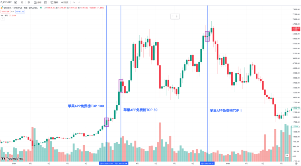
Interestingly, 9 months later, on October 28, 2021, Coinbase ranked TOP 1 on the free list. At that time, the price of BTC was around US$60,000, which was only a short distance from the peak of US$69,000 set on November 8. Just 10 days.
When users flocked to download Coinbase to buy coins, the top features were already obvious.
BTC monthly chart finds it difficult to break the historical record of 7 consecutive gains
It can be seen from the past historical charts that there was only one BTC Dalian rise in a complete bull market cycle.
In the last cycle, from October 2020 to March 2021, it achieved a good trend of six consecutive monthly increases. In this cycle, thanks to the approval of spot ETFs, BTC has rarely achieved 7 consecutive monthly gains.
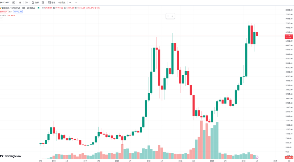
After that, it began to consolidate. In this bull market, since its price is already above $60,000, it will be very difficult to achieve the miracle of 7 consecutive gains in the second half of this bull market.
BTC Unrealized Net Profit/Loss
This indicator is mainly used to measure the profit/loss of players on the Bitcoin chain. We can see that the colors of its rows from top to bottom are red, orange, light yellow, gray white and light blue. The blue at the bottom means that most people are losing money, while the red at the top means that most players are making profits.
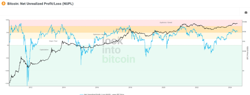
When the line chart is in the light blue area, it is often the bottom range of BTC prices, because people who lose money and cut their flesh continue to leave the market to build a bottom. When the line chart is in the yellow or red range, it is often the top range of BTC prices. Most people After making a profit, there will be quite a few profit-taking orders that choose to take profit and leave the market, leading to the top of the cycle. Back and forth.
Judging from the line chart, the market is currently at a high point in the yellow zone, and more than 52% of Bitcoin players are still in a state of unrealized net profit.
In past cycles, the fold line has dropped sharply to the green range twice, which means that most people are in a state of loss. This cycle has only happened once. It remains to be seen whether history will repeat itself in the future.
HODL supply
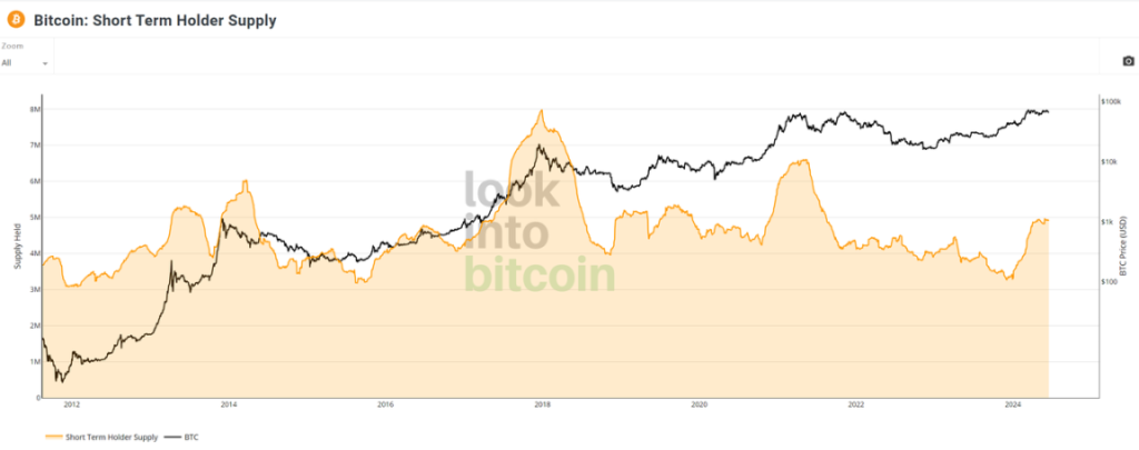
This data chart is mainly used to observe the performance of Bitcoin HODL data. Here we define short-term users as holding the currency for less than 1 year, and long-term users as holding the currency for more than 1 year.
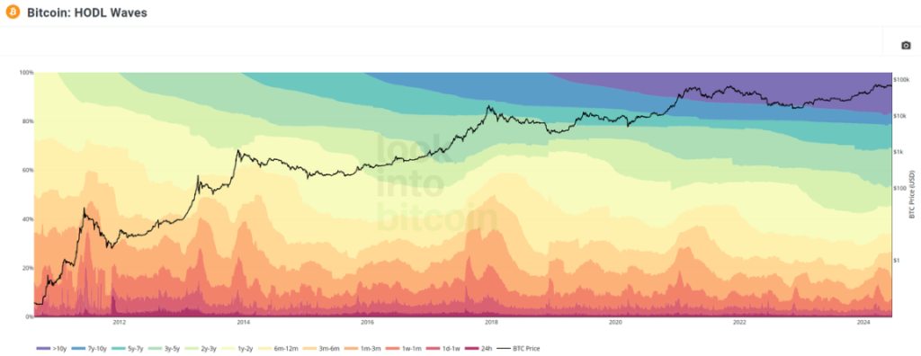
At the top of the bull market, long-term holders often take profits and leave the market, so their proportion will decrease. However, short-term currency holders often rush in to buy when the price is high, and they will see that the proportion of supply is obviously equivalent. high.
If the above picture is not clear enough, you can refer to the picture below. The peak value of the increase in the number of short-term currency holders is often the periodic top of the currency price.
From this figure, we can also find an interesting phenomenon. As the price of BTC continues to increase, players with insufficient financial strength may no longer be able to buy enough BTC. This results in a certain amount of supply for short-term holders. The currency peak has reached its peak, but it is far less than the peak holdings of the past two bull markets.
When the proportion of long-term currency holders declines, it is often the top range of the market (picture below). They are the smart money in the market.
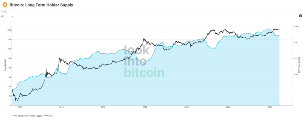
We see from the chart that in the recent bull market, long-term holders began selling in January of this year, accelerated around February, and have continued to this day. So far, its exit speed has leveled off.
Long-Term Trend Indicator MVRV Z-Score
This indicator takes the total market cost as the base and mainly reflects the overall profitability level of the market. The light red area is MVRV, and the line chart is Z-Scroe (highlighting the extreme cases of data between market value and realized value). When the orange line chart touches the light red area, it is the top of the market. If it is further subdivided, when it is above 6, it is also the top range.
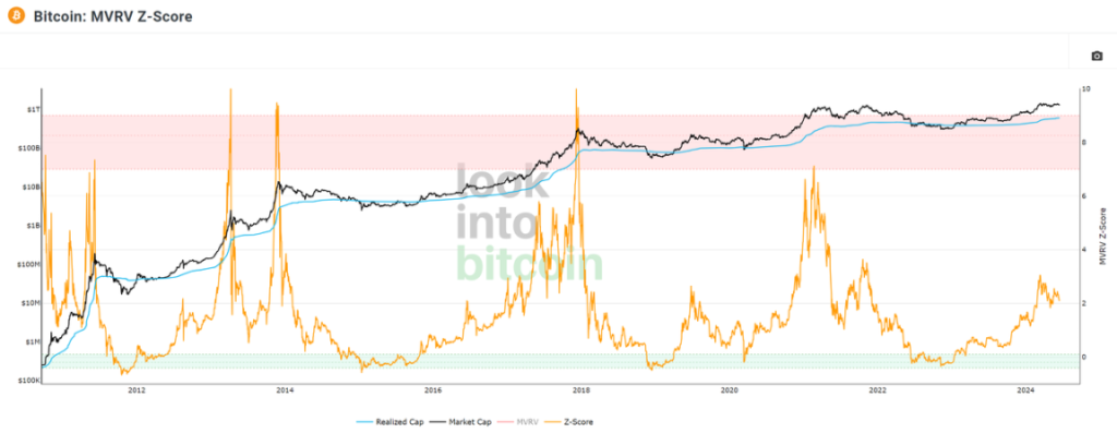
When the orange line chart is in the light blue area, it means that currency holders are generally in a state of loss. The current indicator is 2, which belongs to the intermediate stage.
Bitcoin contract open interest amount
A very interesting phenomenon in the past few months is that whenever the open interest of Bitcoin contracts across the entire network reaches a record high, it is often a periodic BTC price top.
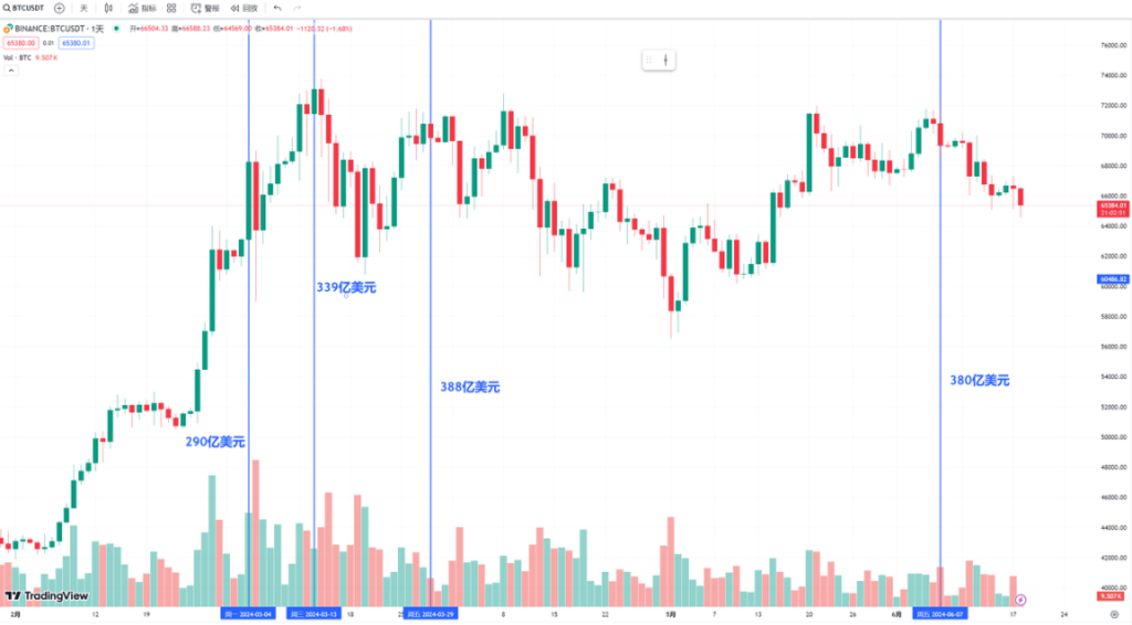
For example,
- March 4, 29 billion US dollars, BTC price 68,499 US dollars
- March 13, 33.9 billion US dollars, BTC price 73,650 US dollars
- March 29, 38.8 billion US dollars, BTC price 70,780 US dollars
- June 7, 38 billion US dollars, BTC price 71,997 US dollars;
Contract data represents market funds’ views on the market outlook. When the market is unanimously extremely optimistic about the short-term trend and continues to increase leverage, there will often be a correction in order to cleanse the chips and move forward lightly.
summary
In addition to the above indicators, methods for judging market conditions also include factors such as Ethereum Gas fees, social media activity, and the integer Schelling point. It is both a science and an art. Investors need to comprehensively and rationally evaluate the above indicators in order to better grasp market opportunities.


