
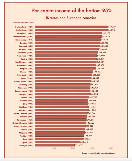
Interesting chart by Seth Ackerman that gives us another way of comparing European and American incomes. I've linked to it on the Chartbook Top Links of the day:
From Twitter
Disclaimer: The content above is only the author's opinion which does not represent any position of Followin, and is not intended as, and shall not be understood or construed as, investment advice from Followin.
Like
Add to Favorites
Comments
Share
Relevant content