
There is one chart that has predicted almost every market crash for the last 50 years.
The oil chart.
1973 oil shock > S&P 500 -41%
1990 Gulf War > S&P -16%
Russia–Ukraine 2022 > S&P -18%
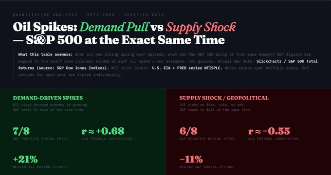
The pattern is simple:
When oil spikes because of economic growth, stocks rise.
When oil spikes because of war, stocks struggle.
Right now oil has exploded from $58 to nearly $100 after the Strait of Hormuz disruption.
But the real danger isn’t the spike.
It’s the duration.
Oil shocks usually take 3–6 months to show up in inflation… and only after that does the Fed react.
Which means markets may still be in the early phase of the shock.
I went back through 53 years of oil crises to see what usually happens next.
Full breakdown in today’s video.
[Link in comments]
From Twitter
Disclaimer: The content above is only the author's opinion which does not represent any position of Followin, and is not intended as, and shall not be understood or construed as, investment advice from Followin.
Like
Add to Favorites
Comments
Share
Relevant content