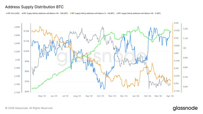
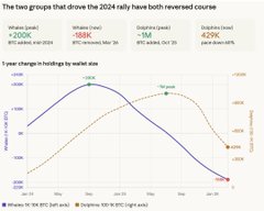
Sometimes seeing this kind of data is really infuriating. It's not that the data is wrong; the data is correct. It's true that #BTC holdings in the 1,000 to 10,000 BTC range have decreased over the past year. But this doesn't mean they've gone from being the largest buyers in the market to being sellers. This is absolutely wrong, because this range could include institutional accounts, exchange accounts, custodian accounts, or even exchange wallets. It's more appropriate to look at it from a higher perspective. For example, in the chart I used, you can see that the yellow line represents Bitcoin addresses holding between 1,000 and 10,000 BTC, which is decreasing, while the blue line represents addresses holding between 10,000 and 100,000 BTC, whose holdings have increased over the past year. The green line represents addresses holding between 100 and 1,000 BTC. This holding has been slowly increasing. So, to assume that a whale is selling off just by looking at one line is simply misleading!
This article is machine translated
Show original

Coin Bureau
@coinbureau
🚨BITCOIN WHALES TURN MAJOR SELLERS
Wallets holding 1,000–10,000 BTC have shifted from the market’s biggest buyers to its biggest sellers in one of the most aggressive distribution cycles on record, per CryptoQuant.
Sector:
From Twitter
Disclaimer: The content above is only the author's opinion which does not represent any position of Followin, and is not intended as, and shall not be understood or construed as, investment advice from Followin.
Like
Add to Favorites
Comments
Share
Relevant content