Top traders' secrets: 15 trading indicators to beat the market

This article is machine translated
Show original
Top traders: 15 trading icons to beat the market
Excellent traders know how to use trading icons to earn excess returns. Today, these 15 little-known Crypto secondary judgment tools are exposed
Suggestion: Like + Collect
🔗aiyanxishe.feishu.cn/wiki/HTOe...

1. BTC ETF flows
Since this bull run is led by institutions, keeping a close eye on the short-term flows of BTC ETFs may help understand whether this demand persists.
http:/coinglass.com There is an ETF tracker that analyzes everything in detail. You can find daily changes in holdings, net flows, etc.

2. Bitcoin rainbow chart
The rainbow chart is a long-term valuation tool for Bitcoin. It uses a logarithmic growth curve to predict Bitcoin’s potential future price direction.
It overlays a rainbow-colored band at the top of a logarithmic growth curve channel in an attempt to highlight the market sentiment at each rainbow-colored stage as price moves through it. thus highlighting potential buying and selling opportunities.
Link

3. DCA Cost Averaging
Assuming that any point below the 2-year moving average is a solid accumulation zone for DCA BTC, then the 2-year moving average multiplied by 5 is a potential sell zone.
I wouldn’t use these charts as absolute fact, but it does help to eliminate noise when looking for accumulation zones.
🔗www.decentrader.com

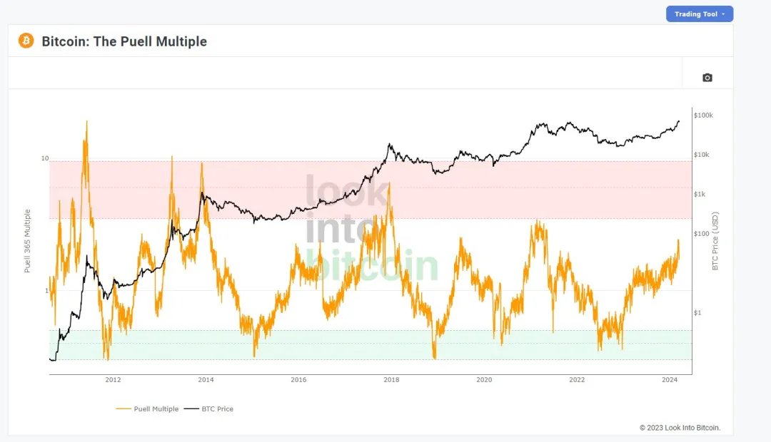
4. Bullish Indicator
While many charts focus on price action, Look into BTC has a strong indicator that looks at profits from a miner's perspective.
The Puel indicator looks at how many miners are making a profit and infers long-term buy and sell areas.
Indicator Direct:
5. Planb Index
Created by the famous analyst PlanB, it provides intuitive feedback on BTC secondary market prices and makes accurate predictions
🔗planbtc.com/s2fchart.png

6. Wallet Loss Percentage
I use this chart to see when to enter a market. Personally, I find the best time to enter a market is when about 50-60% of the wallet is in the red.
Historically, this has given me more insight into historical market bottoms.
🔗aiyanxishe.feishu.cn/wiki/HTOe...

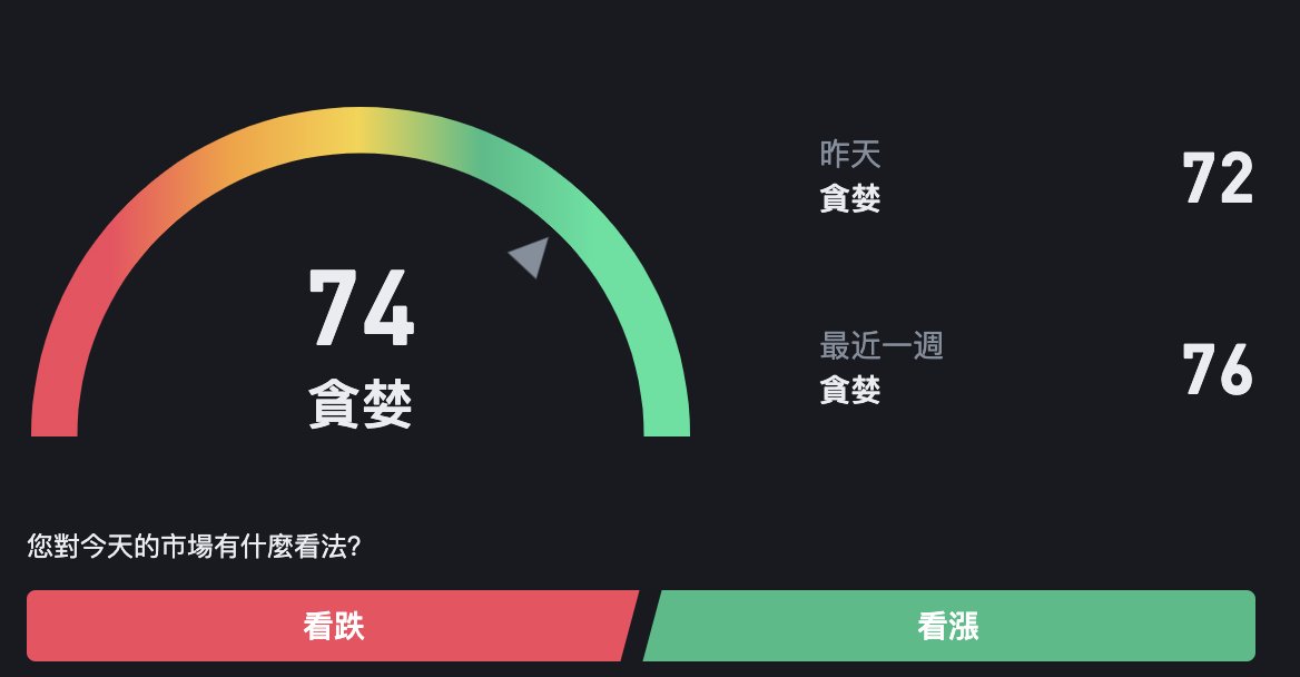
7. Cryptocurrency Fear/Greed Index
The index ranges from 0 (extreme fear) to 100 (extreme greed) and reflects cryptocurrency market sentiment. Low values indicate oversold, while high values warn of a potential market correction. Binance Square integrates transaction data and unique user behavior insights to provide a precise overview.
🔗
8. Basic Metrics
Artemis__xyz has a very nice dashboard that shows you a range of metrics that you can use as a measure of on-chain demand
It helps to understand how the ecosystem is functioning based on daily activity, transfer volume, etc.
Direct to dashboard: app.artemis.xyz

9. Chain Details
Artemis also has a chain dashboard that can be used to discover trending chains using active addresses, transaction volume, fees, etc.
I sometimes use it to discover overlooked on-chain opportunities that gain attention before they get noticed
🔗aiyanxishe.feishu.cn/wiki/HTOe...

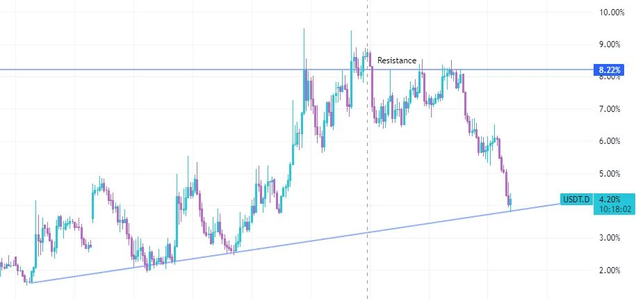
10. Stablecoin status
Usually the dominance of stablecoins is inversely proportional to the price trend of Bitcoin. When I think about the direction of major assets, I like to use it for summary analysis.
11. Token unlock schedule
Before investing money into a project, it is helpful to understand the token unlock schedule
Token_Unlocks is a comprehensive tool that shows you the release rate, unlock schedule, general distribution, etc.
Token unlock direct access:
12. Fund Direction
Understanding the direction of a fund’s investment is a good benchmark for understanding future developments.
Crypto Rank tracks all new financing rounds and groups them into groups, which is useful for discovering new narrative trends.
Direct access:
13. Market Tops and Bottom
If you are a long-term trader looking for buy and sell opportunities, PositiveCrypto has a great chart on GlassNode that shows the historical price action of BTC relative to the 2-year moving average.
Direct to the chart: http:/decentrader.com
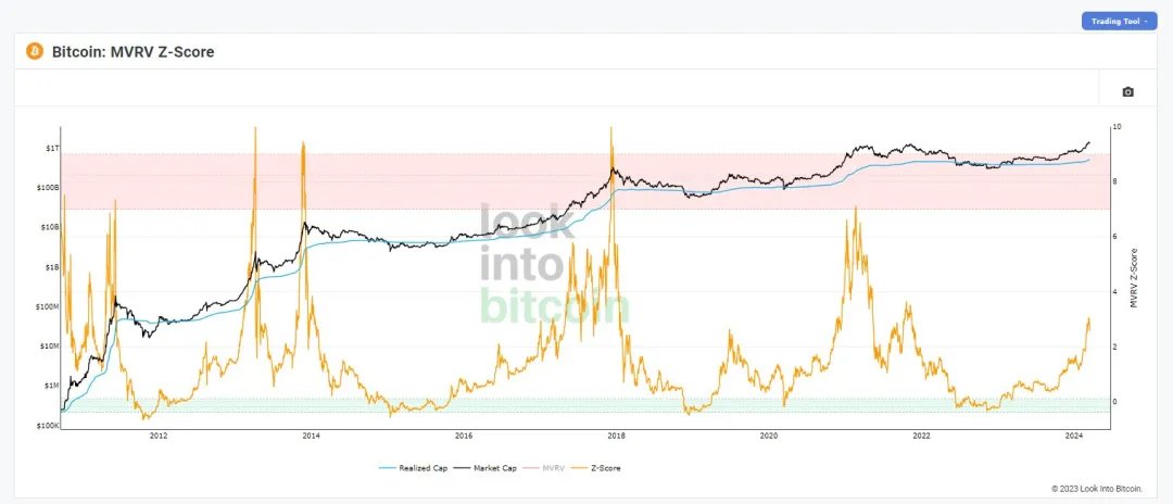
14. MVRV Score
You can use another potential accumulation and selling chart to understand the long-term trend.
The green area indicates the potential accumulation area, and the red area indicates the area to consider risk aversion.
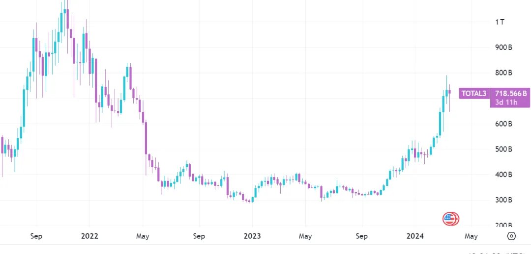
15. About Altcoin
If you want to understand how Altcoin are performing relative to BTC and ETH, these charts can provide clues as to when Altcoin outperform the broader market.
By noting down historical support and resistance areas, I understand when Altcoin are likely to bounce back.
Follow @sunyangphp, forward and bookmark this article
x.com/sunyangphp/status/177989...
Sector:
From Twitter
Disclaimer: The content above is only the author's opinion which does not represent any position of Followin, and is not intended as, and shall not be understood or construed as, investment advice from Followin.
Like
Add to Favorites
Comments
Share
Relevant content