The market is closely watching the Federal Open Market Committee (FOMC) meeting tonight, but a key fact is often overlooked: interest rate cuts are usually already priced in by the market. What truly drives market volatility is not the rate cut itself, but the discrepancy between the actual outcome and market expectations.
As I've emphasized before, when it comes to interest rate cuts, the real interest rate, as well as the magnitude and speed of the cuts, are more important than the nominal interest rate. These two factors are key signals driving asset price movements.
Today, I will guide you through understanding how to capture these signals through data—transforming you from an ordinary observer into someone who can see beyond the surface and understand the true drivers of the market.
Interpreting the Fed's Rate Cut Signals: Tracking the Pace and Magnitude of Rate Cuts
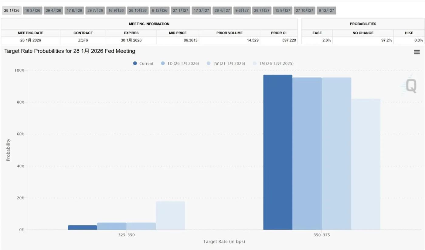
1. Market Expectation Gap: CME FedWatch Tool Predicts the Probability of a Fed Rate Cut
This is the most intuitive tool for quantifying the magnitude of interest rate cuts. It calculates the probability of a rate cut based on federal funds futures prices.
The key is not only whether the Federal Reserve will cut interest rates at its next meeting, but also understanding the probability distribution of such cuts.
If the market initially expects a 25 basis point (bp) rate cut, but FedWatch shows the probability of a 50 basis point cut surges from 10% to 40% within days, this indicates that the market is pricing in a larger "recession narrative," and volatility will rise sharply.
Every shift in expectations regarding interest rate cuts sends ripples through the market. As I mentioned before, the impact of interest rate cuts is usually priced in by the market—what truly causes dramatic price fluctuations is the discrepancy between the actual outcome and market expectations.
Pay close attention to how market expectations change under different interest rate cuts, as shown in the chart. These expectations ultimately depend on US employment and inflation data.
https://www.cmegroup.com/markets/interest-rates/cme-fedwatch-tool.html
2. The Federal Reserve's official intention to cut interest rates: Dot plot
The dot plot, released quarterly, shows the individual projections of future interest rates from 19 Federal Reserve officials.
What we need to examine is the dispersion of the points and the change in the median.
If the dot plot shows that the median interest rate at the end of 2026 is significantly lower than the previous quarter, it indicates that the Federal Reserve has raised the “ceiling” for rate cuts—a positive sign in the long run.
The dot plot and the gap between market expectations above help us measure the magnitude of the interest rate cut.
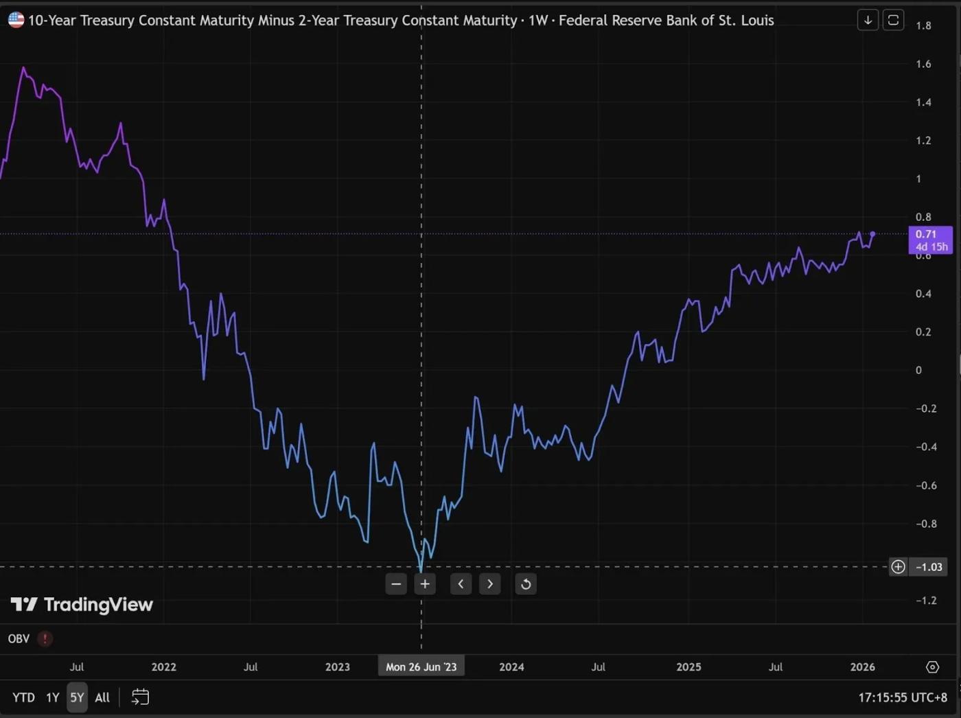
3. The Fed's Interest Rate Cutting Pace: Analysis of the 10-Year - 2-Year US Treasury Yield Curve
The yield curve between 10-year and 2-year U.S. Treasury bonds reveals professional bond traders' views on the pace of interest rate cuts.
The principle is very simple:
- 2Y represents the policy interest rate for the next two years, which is directly controlled by the Federal Reserve's interest rate actions.
- 10Y represents long-term economic growth and inflation expectations.
What is the current situation? We are currently in a phase of “yield curve inversion reversal” (the 10-year Treasury yield has started to exceed the 2-year Treasury yield again, or the gap between the two is narrowing).
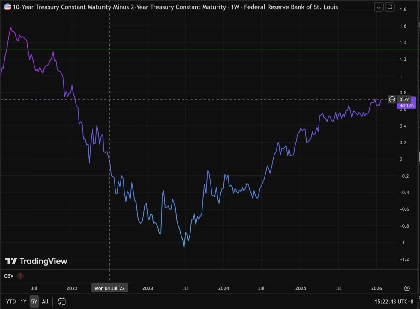
https://www.tradingview.com/chart/O9lEPyjs/?symbol=FRED%3AT10Y2Y
Understanding the inverted yield curve
Generally, due to their longer maturities and higher risks, long-term bonds should yield higher rates than short-term bonds. If the 2-year bond rate exceeds the 10-year bond rate, this is called an inverted yield curve—a signal of a potential economic recession.
This phenomenon occurs when the market perceives current inflation as excessive or when the Federal Reserve raises interest rates significantly, causing short-term financing costs to surge. The two-year Treasury yield is closely correlated with policy rates.
Meanwhile, regarding 10-year Treasury bonds, traders believe that the economy will eventually be "destroyed" due to current interest rates being so high.
When the economy weakens, future inflation will disappear, and the Federal Reserve will eventually be forced to cut interest rates sharply. As a result, investors are rushing to buy long-term bonds to lock in current yields.
Increased buying activity led to a rise in the price of 10-year U.S. Treasury bonds, resulting in a decline in yields.
This is why we can see from the chart that the 10-year - 2-year yield curve was previously inverted, but has gradually reversed its inverted trend from -1.04 in 2023 to the current 0.57.
How to interpret the Fed's rate cut signal from the yield curve decline?
Looking at the yield curve from 10-year to 2-year Treasury bonds, the trend is upward, but the difference lies in what factors are driving this growth.
Remember this formula: 10Y - 2Y
The rapid rate cuts by the Bulls are beneficial to liquidity.
- Price spread chart trend: The curve steepens sharply and rises rapidly.
- In reality, the yield on 2-year Treasury bonds (short term) is falling much faster than the yield on 10-year Treasury bonds.
- Market logic: Weak economic data leads the market to believe that the Federal Reserve will cut interest rates quickly and significantly.
Bearish slope – slow pace of interest rate cuts/inflation rebound, unfavorable to liquidity.
- Price spread chart behavior: The curve rises slowly or fluctuates upward repeatedly (as shown in the chart at the beginning of 2026).
- The reality is that the yield on 10-year Treasury bonds (long-term) is rising, while the yield on 2-year Treasury bonds is rising or falling very slowly.
- Market logic: The market is worried about a rebound in inflation (expectations of rising inflation again), or believes that the economy is too strong and the Federal Reserve does not need to cut interest rates.
Clearly, we are currently in the steepening phase of a bear market. Looking at the 10-year and 2-year yield curves separately, their 5-year trends both show a recent upward trend.
This means that the current rate cuts tend to be "precautionary rate cuts"—the Federal Reserve is gradually cutting rates, like squeezing toothpaste, squeezing a little and then stopping.
When will the market truly feel the impact of the Fed's rate cuts?
The cryptocurrency market will only see liquidity and asset prices truly surge when the 10-year minus 2-year yield curve steepens significantly.
When liquidity is injected, various industry narratives emerge to ignite the market.
Narrative is merely the surface—it can exist in any field, like an actor pushed onto a stage. What truly matters is the number of paying audience members watching.
The above views are from @AAAce4518