This article is machine translated
Show original
This indicator is quite interesting!
However, the sample size is relatively small (only 5 times), making it prone to overfitting; if bear market oversold conditions were included, the trajectory might be different. Of course, its premise is that the traditional 4-year cycle has been broken.
Just like our "three-line convergence," the sample size is even smaller (only 3 times), so I categorize it as a mystical indicator 😂.
------------------------------------------ The author's view:
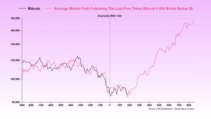
He believes that BTC is currently in a typical "oversold" phase (RSI indicator has fallen below 30), and has drawn an "average recovery path" for BTC prices based on historical data (several similar situations in the past). The current price movement almost perfectly matches this historical average trajectory: starting from the oversold point, it first consolidates at the bottom (chop), and then gradually rebounds upwards.
He emphasizes that the traditional "4-year cycle" is not actually driven by halvings, but by the public debt refinancing cycle. This cycle was delayed by a year after COVID, and now, due to the extended debt maturity structure, the 4-year cycle has "officially died."
Based on his macroeconomic analysis (business cycle, financial conditions, global liquidity expectations), this bull market is likely to continue until 2026, rather than ending soon. Because a large amount of global interest payments still need to be addressed through monetization (printing money), far exceeding GDP growth, this will drive more liquidity into the market, supporting the rise of risky assets (such as Bitcoin).
However, bottoming out takes time and will involve a lot of volatility. If the bull market hasn't ended, this trajectory chart will still be valuable for reference.
------------------------------------------ The Indicator's Principle The indicator he shared is based on the "oversold recovery trajectory" model of the Relative Strength Index (RSI).
He selected several historical events where Bitcoin's RSI fell below 30 (extremely oversold) (the post mentions only 5 times, all during bull markets), then aligned these events (t=0 being the moment the RSI fell below 30), calculated the average percentage change in BTC price from that day, and plotted a "composite average trajectory line."
The current BTC price movement closely matches this historical average line, so he believes it may continue to follow this pattern: bottoming out and then moving upwards.
This is a historical composite analysis, similar to the average performance statistics of specific events in the stock market (such as the stock market performance after a Fed rate cut). It doesn't predict precise prices, but rather provides a probabilistic reference: historically, after similar oversold conditions, prices often recover in this way.
However, the author also acknowledges that the indicator is not perfect (the sample only includes 5 instances, all within an upward cycle), and it won't match exactly the same results, but it's useful as a reference tool.

Julien Bittel, CFA
@BittelJulien
12-17
A lot of people have been asking for an update on this chart, so I’ll just leave this here for anyone who needs to see it.
This shows the average BTC trajectory following an oversold RSI reading, with RSI falling below 30 at t=0.
So far, it’s been pretty bang on.
Unless you
Thanks M for sharing!
Many people are unfamiliar with the concept of "overfitting." In layman's terms, it's "unrealistic and flawed reasoning based on a small sample size," which is a shame newbies love to read about 😅
However, the author's points do have some logic, rather than simply hoping history will repeat itself.
Hopefully, BTC will rise as expected and give the bulls a boost 🫡
Sector:
From Twitter
Disclaimer: The content above is only the author's opinion which does not represent any position of Followin, and is not intended as, and shall not be understood or construed as, investment advice from Followin.
Like
Add to Favorites
Comments
Share
Relevant content