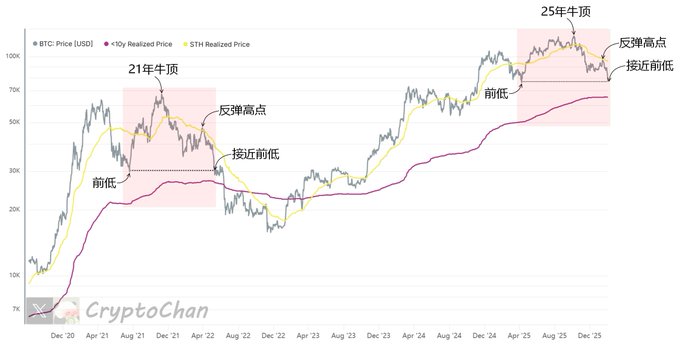
The chart shows the end of the last bull market and the beginning of a bear market. The gray line in the chart represents the BTC price; the yellow line represents the average cost price for short-term BTC holders; the magenta line represents the average cost price for long-term BTC holders (excluding those held for more than 10 years). Indicator Introduction— #BTC Short-Term Holder Average Cost Price Indicator: The average entry cost (price at the time of last transfer) for short-term holders (holding for <155 days). Reflects: the profit/loss status of the short-term group; when the price is higher than the average price, there is profit, making it easier to hold and rise; when it is lower, there is loss, making it easier to sell and form downward pressure or support levels, identifying the bottom of the short-to-medium term market. #BTC Long-Term Holder Average Cost Price (excluding those held for >10 years) Indicator: The average entry cost for long-term holders (holding for >155 days, excluding those held for >10 years), focusing on active long-term groups and avoiding distortion from zombie coins. Reflects: the profit/loss status of the long-term group; when the price is higher than the average price, there is profit, making it easier to take profits and form upward resistance; when it is lower, there is loss, but it provides downward support, judging the bottom of the bear market or a cycle turning point.
This article is machine translated
Show original
Sector:
From Twitter
Disclaimer: The content above is only the author's opinion which does not represent any position of Followin, and is not intended as, and shall not be understood or construed as, investment advice from Followin.
Like
Add to Favorites
Comments
Share
Relevant content