Author: Murphy Source: X, @Murphychen888
In the on-chain data analysis of BTC, there are 2 core concepts, namely "timestamp" and "price stamp". Due to the transparency of the blockchain, we can observe each on-chain transaction and identify two key details: 1. The time when the chip movement occurs: timestamp; 2. The price at the time of the transaction: price stamp;
When analyzing the process of periodic trend changes, the data used, such as turnover cost, profit realization, demand inflow, and hot supply, are mainly based on the "price stamp". If we want to observe and analyze the time characteristics of the BTC macro cycle, we need to use the "timestamp" more.
Each BTC exists in a certain UTXO, and the timestamp function of UTXO means that each BTC has an age, which is not the time it was mined, but the time from the last movement to the current time.
We can distinguish BTC of different coin ages by time length, such as dividing them into 1 week-1 month (1w-1m), or 1-2 years (1-2y), etc. Usually, we classify BTC that have not moved for more than 6 months (accurately more than 155 days) or more as long-term holders (LTH) chips, and the rest as short-term holders (STH) chips.
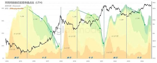
Looking back on the entire history of BTC, during the bull market cycle, LTH will distribute chips to STH; at this time, the proportion of wealth owned by the "old coin group" will gradually decrease (as shown by the green dotted line in Figure 1);
(Figure 1)
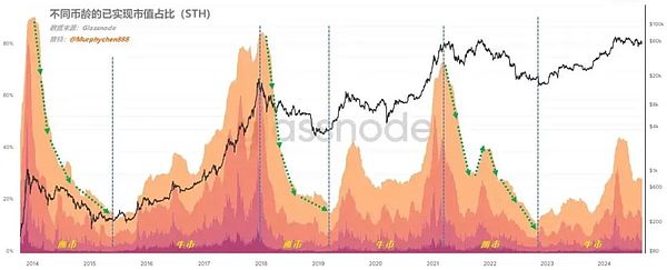
In the bear market, the chips will return from STH to LTH, and at this time, the proportion of wealth owned by the "new coin group" will gradually decrease (as shown by the green dotted line in Figure 2);
(Figure 2)
It can be seen that the waveforms in Figure 1 (old coins) and Figure 2 (new coins) are exactly opposite, which I call the "pendulum effect" of the BTC macro cycle; the market always follows this inherent law of supply and demand conversion, just like a pendulum, going back and forth.
In the large group of LTH, the groups with the greatest impact on the cycle transition, and even able to play a decisive role, are the chips of 1-2y and 2-3y (diamond hands in the cycle). We can roughly infer the "timestamp" of this bull market cycle by observing the changing trend of this data.
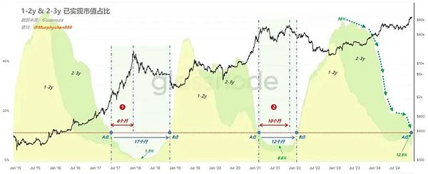
Figure 3 shows the data of the realized market value ratio of 1-2y & 2-3y. First, from the overall perspective, when the yellow (1-2y) and green (2-3y) waveforms reach their peaks, it means that the market is about to emerge from the bear market and enter the early stage of the bull market. As time goes by, the waveform begins to gradually decline, indicating that this group is distributing chips to new entrants to the market.
(Figure 3)
When the waveform drops to the bottom and the slope begins to flatten, it means that the market is in the mid-to-late stage of the bull market, and can also be considered the "top range" of the bull market. It should be noted that these 2 groups are the most experienced investors in the market, such as MSTR, which bought BTC 3 years ago, i.e. in the period of December 2021 to January 2022. At the time of purchase, they were STH, and now they have become LTH.
Currently, this data has dropped from a peak of 56% to 12.3% (the green dotted line in the figure), while the lowest values in the previous two cycles were 1.3% (17-18 cycle) and 6.6% (21-22 cycle). Considering the increasing participation of cross-cycle institutional investors like MSTR in the coin-holding group, I believe that the lowest value of the 1-2y & 2-3y ratio in this cycle should be higher than the 6.6% of the previous cycle, and is likely to be between 7%-10%.
If we draw a standard line based on the current value (point A) (see the red dotted line in Figure 1), we can see that in the previous 2 cycles, when the indicator dropped to the same position, the price of BTC was in the top range, relatively in the mid-to-late stage of the bull market. As time goes by, the curve gradually touches the bottom and starts to turn upwards, and when it returns to the original height (point B), it usually means the end of the bull market.
From A to B is a "smile curve", and in the 17-18 cycle the entire process took 17 months, and the 21-22 cycle took 12 months, and based on the analysis above, the probability that the "smile curve" of this cycle will be less than or equal to 12 months (entering the bear market) is higher.
At the same time, we can see that in the 17-18 cycle, the time from point A to the last high point of the cycle was 6 months (Figure 3 note 1); in the 21-22 cycle, the time from point A to the last high point of the cycle was 10 months (Figure 3 note 2).
Since the 17-18 cycle is a very special sharp top, its reference value is relatively low; the more valuable reference should be the double top cycle of the 21-22 cycle; therefore, I believe that the probability of this cycle being less than/equal to 10 months from the current point A to the future point B is higher, perhaps around 9-10 months.
If this inference is correct, the end time of this bull market cycle will be roughly in the 9-10 month period of 2025.
Note! All the probabilistic inferences above are my personal subjective opinions, not the objective feedback of the data!
After discussing the relationship between coin age conversion and cycles, let's look at it from another angle - metaphysics! Three-line synchronous resonance curve
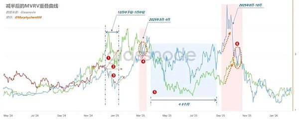
I roughly counted that the frequency of mentioning the "three-line convergence" indicator in the background messages I received was the highest. The little partners seem to be very obsessed with this; although I know that this indicator has shown amazing accuracy many times in this cycle, I still believe that we should not put the cart before the horse. We should first look at the objective data, and then use the "three-line convergence" to cross-reference and refer to.
(Figure 4)
Based on the information feedback in the figure, I give the following relatively subjective interpretations, and the little partners should view them rationally and not use them as the only basis for judgment!
1. The red line has now reached a critical turning point. From the position, the red line is closer to the blue line, and the distance from the upper green line has widened a bit, and there is no consistent convergence of the three lines.
That is to say, in the period from mid-December to mid-January, there will be 3 possible deviations: continue to break new highs (Figure 4 note 1) / consolidate (Figure 4 note 2) / pullback (Figure 4 note 3); but from the overall trend, the green line and the blue line are in a pullback state during this stage. Therefore, I personally think the probability of 3 and 2 is greater than 1;
Emotionally, I hope it's 2, and the possibility of 1 is the lowest; of course, a moderate pullback will also be more conducive to the continuation of this trend.
2. Many partners may remember that in my previous analysis of the "three-line convergence" indicator, I mentioned: "Around 2024.12-2025.1, MVRV will experience a significant pullback". Currently, from the comprehensive observation of other on-chain data, this so-called "significant" may not be as large as imagined. There are two reasons:
a. The current on-chain chip structure distribution has formed a huge column of 60w BTC at the $97,000 level, and there is an accumulation of nearly 200w BTC in the $9,400-$10,000 range, forming a potential support range.
b. From the current new demand data, although there is a decline, it has not quickly dropped below the zero axis. That is to say, the market still has a certain scale of demand and can maintain a certain degree of balance.
3. The green and blue lines in the figure converge at the position marked 4, and the convergence position is significantly higher than the current (Figure 4 note 4), indicating that there will be another wave of market in March-April 2025.
Based on the current "on-chain average turnover cost" and "active investor average cost" data, I estimate that the price of BTC in March-April may have a certain probability of reaching above $12,000, but not exceeding $15,000 (since the turnover cost will change, this estimation needs to be recalibrated every 2 weeks).
4. If this rebound occurs in March-April, it may be the end of the current trend cycle, and then it will depend on changes in macroeconomic policies.
5. After that, the market may enter a 4-5 month consolidation period (as marked 5 in the chart), during which the green line and the blue line will be consistent in a downward trend in the early stage; but in the middle, they will start to diverge, so there is a lot of uncertainty here. But overall, the high point of the wide range consolidation will not exceed the peak value of the March-April wave.
6. There will be the last wave of this cycle in September-October 2025 (as marked 6 in the chart), during which the green line and the blue line will have a large divergence in the early stage. If the red line approaches the blue line at that time, the high point of this wave will be higher than the peak in March-April; if the red line approaches the green line, the high point will be lower than the March-April peak.
At the same time, we can see that the green and blue lines converge in the part circled by the red dotted line, and this position is lower than the March-April peak. This may mean that the probability of the September-October high point being lower than the March-April high point is greater.
Interestingly, the conclusion of the "occult indicator" is highly consistent with the time-based inference based on coin age conversion in the previous text. If this is really the case, it means that the highest point of this cycle will appear in March-April 2025, and the high point that appears in September-October 2025 will be the last "top" of this cycle, and the height may not necessarily be higher than the previous one (I personally tend to be close to the previous high, not necessarily significantly higher).
From a trading perspective, once entering the top area, I still insist on firmly executing the trading discipline and making a plan for staged profit-taking as long as there are signs of stage-by-stage decline, even if there may be higher highs in the future (this is a probability issue). The BTC positions released after profit-taking may consider switching to some quality ALTs, trying to find the second growth curve that can outperform BTC in the second half of the bull market.


